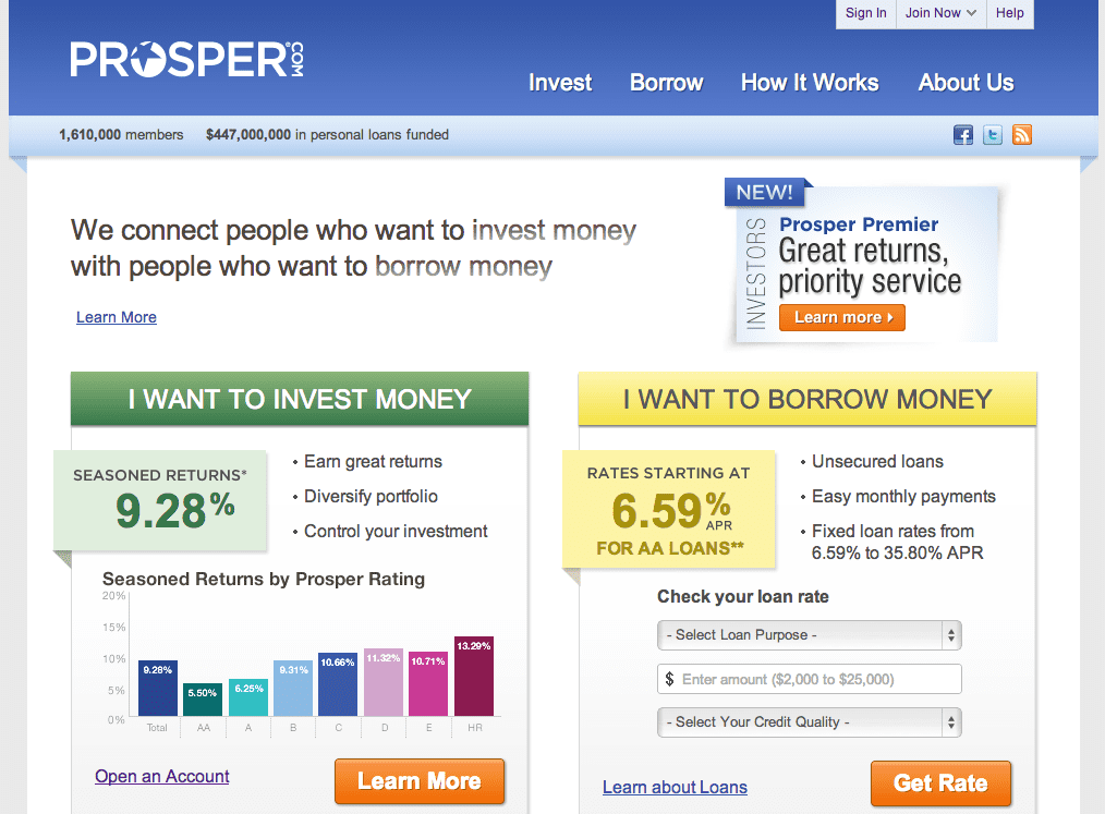
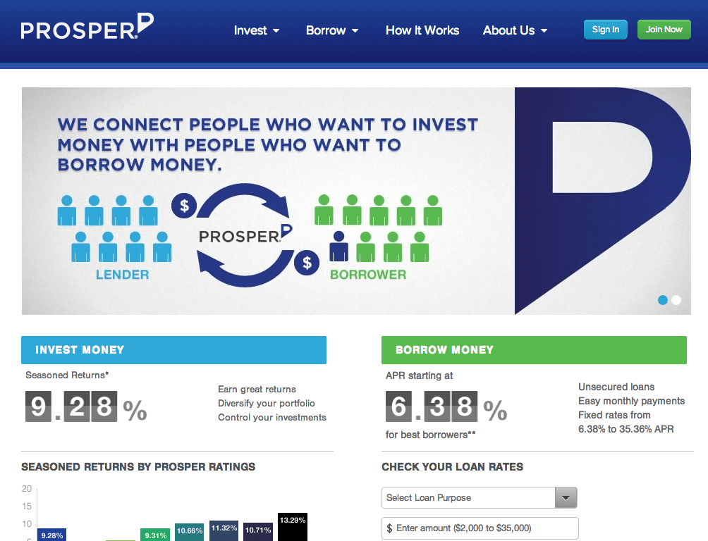
Late last night Prosper shut down their website and launched a new look. Below are before and after screenshots of their home page.
The main functionality of the site is unchanged but there are a few noticeable differences between the new and old home pages:
- New logo removes the stylized “O” and adds a stylized “P” as the end of their name and drops the .com.
- No box promoting Prosper Premier in the new page.
- Social media links moved to the bottom of the page.
- Large animated box near the top of the page that changes.
- The Sign in and Join Now links at the top of the page are more prominent now.
With any change like this there will be people who like it and people who hate it, it is a totally subjective thing. As for me I like the new look, it is crisper and cleaner and looks more professional in my opinion. What do you think?


