If you have logged into your Lending Club account today you will have noticed something new. Underneath your Net Annualized Return (NAR) number you will see a new link: Understanding Your Returns. This takes you to a brand new screen (just launched late yesterday) with some very interesting information.
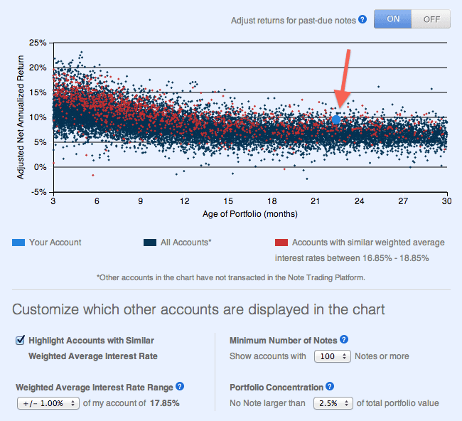
Here is the graph I am presented with when I go to this screen in my main Lending Club account. I will explain this graph in detail below.
First we will deal with the purpose of this graph and then explain what we are looking at. Here is what Lending Club says:
The purpose of this chart is to illustrate how returns typically decrease over the life of an investment. If your account is relatively new, it is likely that your returns will decrease over time as some of your Notes become past-due and charge off. This chart is not a prediction of how your portfolio will actually perform and there are many factors that can impact your returns
A criticism that has been levied against Lending Club in the past is that they do not set investor expectations well enough. I hear this from new investors regularly. They are delighted with their 18% return and fail to realize that most likely this return will reduce to 8-10% as the account fully ages. This graph clearly shows a downward trend in NAR through at least month 18.
Here are some key points to help you understand this chart:
- While each dot represents a Lending Club account, not all accounts are included in this chart. The default is to show only accounts with 100 notes or more and with no note larger than 2.5% of the portfolio.
- Every dark blue dot represents one account at Lending Club showing two data points: their NAR and the age of their portfolio.
- Every red dot represents an account with a similar risk profile to your own. In the graphic above you can see my weighted average interest rate in this account is 17.85% so the red dots show every account with at least 100 notes and a weighted average rate of between 16.85% and 18.85%.
- The large light blue dot is your own account. I have highlighted my light blue dot with the red arrow.
- In this graphic I have chosen to use Adjusted NAR (because it is more realistic) but you can also display the graph with regular NAR by toggling the ON/OFF switch on the top right of the screen.
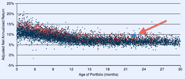
So what happens when you change the filter from at least 100 notes to 500 notes? My account here has almost 1,700 notes so when I choose to display only accounts with at least 500 notes this is what we get. You can see in the graphic below there are far fewer accounts and a narrower band of returns particularly when the account ages.
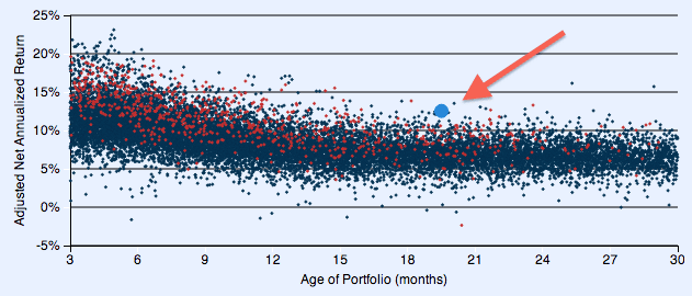
My most aggressive account is my Roth IRA account with a weighted average interest rate of 19.2%. This is the account where I have focused completely on the high risk loans (grades D-G) from day one and where I use my tightest filtering. Not surprisingly, it has the highest NAR of all my Lending Club accounts. And it is also performing well against accounts with a similar risk profile. Here is my graph (below) for this Roth IRA showing those accounts with a similar risk profile and a minimum of 100 notes.
One Limitation – No Comparison To Folio Trading Accounts
For those people with Folio trading enabled on their account, your account will not be included for comparison here. Now, you will still be able to see your performance on this chart but your own account will be removed from the comparison graph of others. So, all the dots we see in this screen are for accounts that have never traded on Folio. I double checked this with Lending Club.
So, in the graphs above, my main account has had some Folio trades so my dot will be excluded from everyone else’s graph when others are seeing this graph. But in my Roth IRA I have never done a Folio trade, so in this case my dot will be included in everyone else’s graph.
Why? Because NAR does not account for trades on Folio. I know they are working on a tool that will display returns accurately for people who make trades on Folio but that tool is not ready yet.
My Take on the New Graphs
You are probably not surprised to hear me say this: I love these graphs. When Lending Club called me when this change went live yesterday afternoon and told me to check it out, my first reaction was wow! This is just the kind of thing I have been wanting – something that not only can set investor expectations but also provides a way to compare yourself to other investors. Some people invest in only B and C grade loans and then complain that their 7% return is below average. This will allow them to see that for their risk profile they may even be doing better than average.
Are these graphs perfect? No. I would like to see a way to turn off the dark blue dots so you are only seeing the red dots. I would like to see more granular filters for number of loans, not just three settings of 100, 250 and 500. I would like to be able to look at different portfolios in my account and just compare them (excluding the other notes). It would be nice to see selections to segregate 36 and 60 month loans.
Having said all that, I think this is a fantastic 1.0 implementation of these graphs. I think I will start to include these graphs in my quarterly updates.
One final note. Lending Club made a second change yesterday – an updated Lending Club PRIME. I will be discussing that change on Monday.
Now I would like to hear from you? Do you think this is useful or something that you will glance at once and never look at again. Please leave your thoughts in the comments below.


